The Phantom UI Control
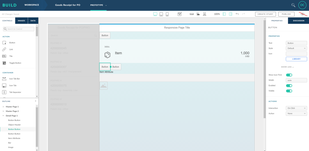
Sometimes when quickly using the undo key (Ctrl-Z), an item will be deleted off the “outline” yet not from the screen itself. This leaves an after image where the UI segment cannot be interacted with, but is still visible. Generally, this can be fixed by logging out of the build program (after saving of course), then closing Chrome and reopening everything.
If this does not solve the problem, try deleting the item from the outline again (as it will have usually come back at this point) and repeat the first step.
Auto-Save feature & Prototype Corruption
“Build” incorporates an auto-save every time anything is done in the prototype editor. This can be a problem because before hitting the “preview” button, one must wait for the save to be completed. There is usually a 3 second lag time on the save process, so make sure to wait before previewing the prototype or you risk your prototype being corrupted.

Wait until the save completes before clicking “Preview!”
Context sensitive navigation
Excel Models can be imported into Build as a type of “Ad-Hoc” database. This allows the mockup to navigate between pages with context-sensitive navigation. The main benefit of this is that you can present a prototype with the façade of some real functionality. Your stakeholders will thank you!
For example, if you create a page with a list of burgers and a page with the details of a burger, you can use contextual navigation between the two pages. Clicking on a “Fish Burger” will take you to the details page of a Fish Burger. Alternatively, clicking on a “BLT” will take you to the details page of a BLT. In Build, these are the exact same two pages, but will be populated with the relevant data from the excel “database.”
Parent and Child Items
Using the right-hand side “Properties” menu when selecting objects is a pretty powerful tool inside of Build. This allows one to create “Child objects” of other items. A great example of this is with the “Icon Tab Bar” control.
If a specific pictorial icon is selected on this control, for example the “Ok” button…
![]()
…it is possible to use the “Properties” menu (lower right hand side) to create another row of icons underneath that is nested under the parent icon set. Simply navigate to the “Children” area and click “Content”, then go to the bottom here and click add “Icon Tab”. This will nest another row of icon tabs below the currently selected group. Icon-Tab-Inception!
Super User Tip: This is also a great way to keep completing your mockup pages when Build’s drag and drop interface starts misbehaving. Instead of fighting the interface, just use the child items to add additional controls to your screens! It might take a bit longer, but it’s generally better than waiting for Build to resolve whatever issue is currently plaguing it
Creating Responsive Pages
Personally, we don’t love how the current responsive page layout works. It was designed by SAP to provide a way to drag and drop UI items onto your screen, with automatic alignment suited to tablets and phones. What it really does is provide a snapping dynamic for all the UI controls you drag into the program. These are snapped from the top left of the page to the top right until the row is full. This page forces a horizontal layout, and doesn’t leave a margin for editing the page later, without accidently destroying the whole layout. In general, it is better to work with a “Freestyle Page”, “Master Detail” or another template.
Publishing a Prototype for User Studies
When browsing SAP’s help guides, it seems like the program won’t let you edit a prototype after it has been published. Thankfully, this is not the case. A prototype can be published multiple times with the only caveat being that it needs to be published at least once to be bound to a user study. To do this, simply scroll to the top right of the prototyping page and click “Publish.” After doing so, you will be provided with a shareable link!
As a side note, user studies in Build are quite valuable, as they allow you to email your prototypes around, let your stakeholders interact with them, and provide feedback through comments. Additionally, the user study functions as a quantitative analysis of sorts, by providing you with:
- a heatmap of where your users clicked
- time taken to get through the application
- custom page start and end goals
Currently, there is no way to create a user study by using a prototype that has not been published.
There you have it – 6 things that you might have not known about SAP’s Build software. Do you have any tips on how to navigate through Build, or any frustrations with the program in general? If so, please leave a comment down below.
If you’d like to share your thoughts or wish to discuss any of our products and accelerators, please don’t hesitate to contact us.
Stay tuned for next month’s article on the Manifest.JSON file often found in newly developed SAP UI5 applications.

Thomas Rautenbach, Architect
Thomas Rautenbach has over 20 years of diverse systems experience with a strong focus on system and integration architecture and software design and development. He has detailed technical, functional and system knowledge across the SAP technology platform, including extensive experience with the Finance, Supply Chain, Sales and Distribution, and Human Resources modules.
Follow Pangaea Solutions on LinkedIn
Documentation Links
Login to Splash/Build
https://www.build.me/splashapp/
Official help site for “Build” (including most of the documentation)
http://sap.github.io/BUILD_User_Assistance/Splash/821343eec86945f0b01980286f1fcdb2.html
Fiori UX Design Guidelines
https://experience.sap.com/fiori-design-web/explore/
SAP’s own Build Webinars can be found at the below link. All three of them detail the main functionality in Build, with some use cases and examples. https://standard.build.me/splashapp/communityDetail/267
SAP’s playground where you can practice using prebuilt UI5 applications
https://www.sapfioritrial.com/


